Visualise data with graph | Factry Historian Training Video | Grafana Basics
Learn how to create meaningful time-series graphs in Grafana using data from Factry Historian.

This tutorial introduces the basics of graphing data in Grafana using Factry Historian as the backend. It walks you through setting up a time-series graph panel, choosing variables, adjusting axes, and applying standard transformations to make trends visible and understandable.The video covers key options like time ranges, display formats (lines, points, bars), unit selection, and panel interactions. It’s designed for engineers, operators, and analysts who want to build useful dashboards without needing to write complex queries.By the end, viewers will understand how to move from raw historian data to clear, actionable graphs that help teams track performance and respond to deviations quickly.
Subscribe to our newsletter
Stay updated on the latest Factry news and gain insights to improve the way your factory works.

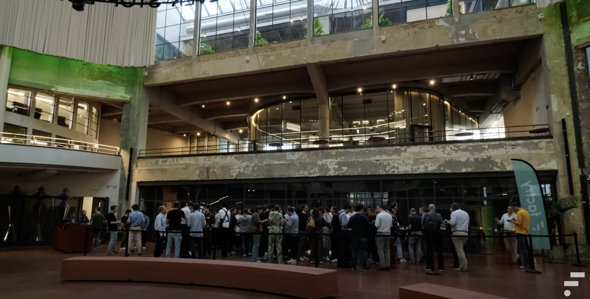
Factry Connect After Hours┃Edition 1 ┃ Wintercircus Gent
Put your industrial data to work
Ready to get started with Factry? Awesome! Let’s schedule a call so you can discover how our platform empowers your operations.

.webp)
.webp)