Reducing Energy & Water Consumption in Industry 4.0 with Grafana
Jolan De Cock
on , updated
Discover how to effectively utilise the Grafana dashboards in Factry Historian to optimise your plant’s energy and utilities consumption. Explore a real-life application in the food industry.
In a brand new blog series, we explore some of the most insightful data dashboards you can build with Factry Historian. In this article, we shed light on how you can use the historian to measure, analyse, and optimise energy and utilities usage, driving cost reduction and more sustainable operations.
The problem many Industry 4.0 companies are facing
Energy consumption plays a pivotal role in the manufacturing industry, representing a significant cost that can make or break the bottom line. As such, having accurate and real-time data on energy or utilities consumption across different stages of the production process is an absolute necessity.
However, from our experience, many companies still lack fundamental insights into their energy and utilities usage, preventing them from getting the maximum potential out of their business. Or they rely on proprietary point solutions with limited functionality, making it impossible to integrate data.
Energy & utilities monitoring using Grafana dashboards
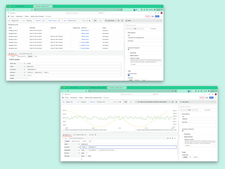
Factry Historian ships with the open source data visualisation tool Grafana, a generic solution with unprecedented flexibility. Data collected and stored in the historian is visualised in custom dashboards that fit your exact needs, with complete freedom to build, duplicate and edit any type of dashboard.
Imagine the world of possibility:
Integrate data and link energy usage to production runs, batches, etc.
Compare real-time energy consumption data with historical values
Display the actual energy cost per amount of product in dashboards, derived from the energy consumption
Improve the bottom line by enabling a continuous improvement cycle
Utilities consumption (energy, water) on production equipment/workshop level
So, what do the historian’s utilities monitoring dashboards look like in practice? Here’s a real-life example of one of our clients in the food industry.
Real-life example: water usage monitoring at Agristo
Agristo is a Belgian company specialising in the production and supply of frozen potato products, and is one of the leading players in the global potato processing industry.
To collect, store and visualise production data, they use our IIoT platform Factry Historian. Amongst a variety of dashboards that help them optimise operations, they use the historian’s visualisation capabilities for monitoring and analysing the plant’s utilities consumption.
Let’s deep dive into some of their Grafana dashboards.
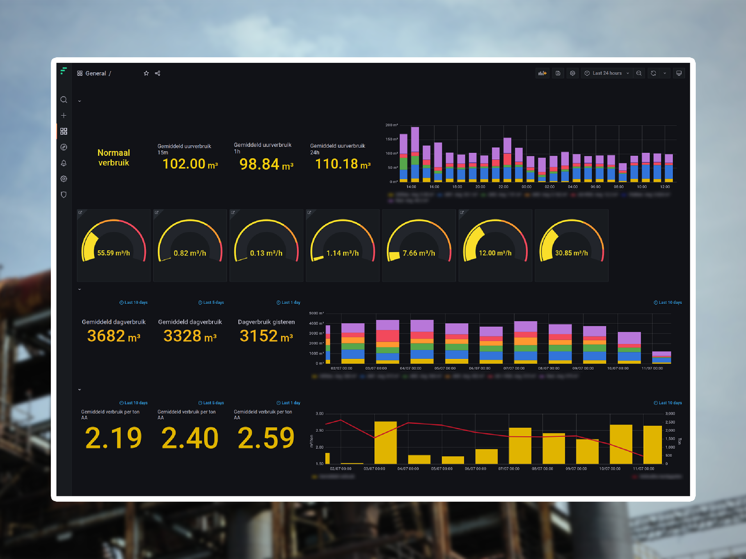
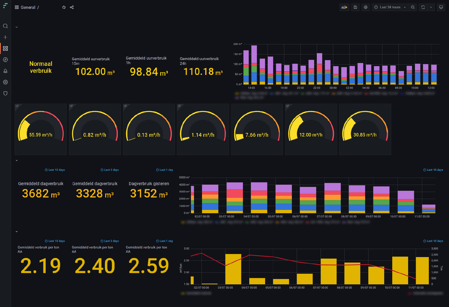
1. Overall water usage per production site or line
✔ Current water consumption is displayed in real-time, per equipment or per line. Data is collected through gauges with a flow metre.
✔ The numbers on the top left of the dashboard indicate the current total water consumption , displayed over a period of 15 and 60 minutes, and 24 hours.
✔ The bar chart on the top right indicates the total water consumption over a certain time period, distributed over different equipment or consumers.
✔ At the bottom left, operators and managers can consult accurate metrics on the mean water consumption over multiple days, weeks or a month.
✔ The yellow chart shows the total water consumption allocated to a lot or sublot . For Agristo, this corresponds to the water consumption per ton of potatoes processed.
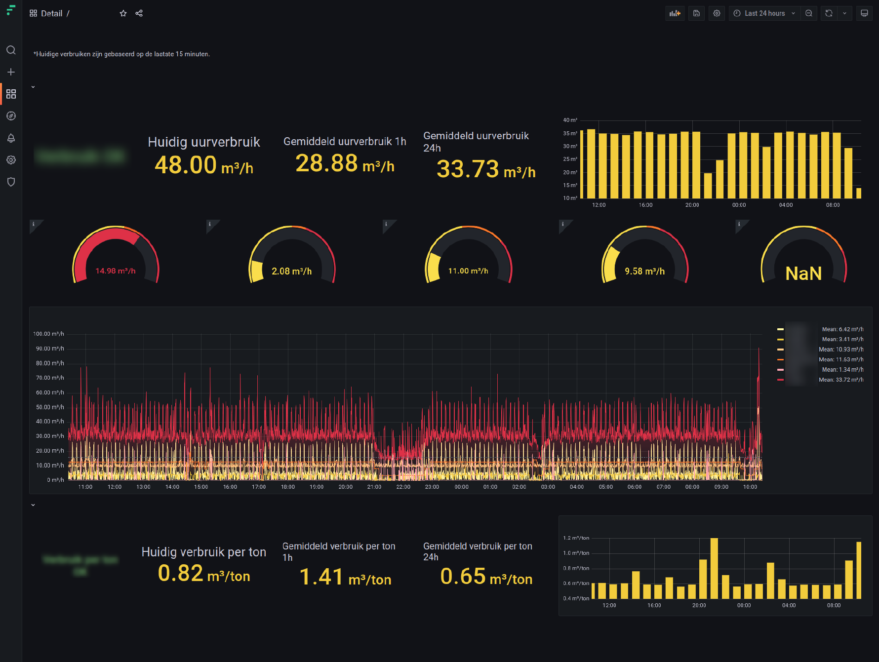
This dashboard shows the water usage for one production line.
✔ The current flow metrics are displayed in real time, for each part of the production line or each step in the process (peel, cut, sort, blanch, etc.).
✔ The top yellow chart indicates the total water consumption over the past 24 hours, while the yellow chart at the bottom shows consumption per ton.
✔ The large graph on the bottom part of the utilities dashboard offers a fine-grained view of the water flow for each step of the process.
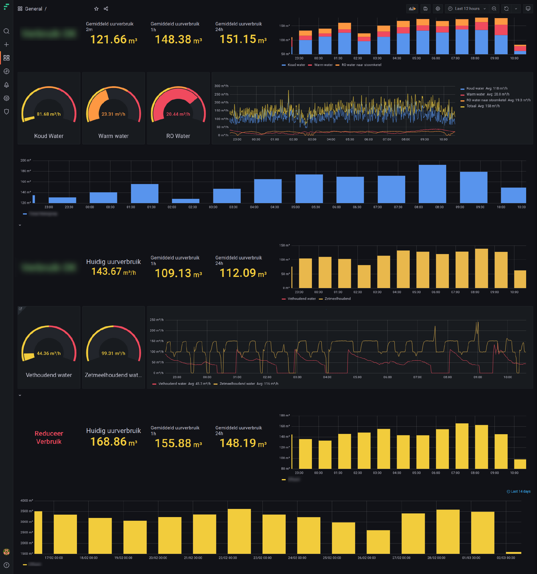
3. Distribution of water types
The dashboard below represents the distribution of water consumption over different types of water: cold, hot, and wastewater containing fats, starch, etc.
✔ The yellow metrics on the top left display overall water usage for the past 2 minutes, 60 minutes and 24 hours. The coloured bar chart on the top right, displays an overview of distribution per water type.
✔ Below, operators and production managers can zoom in on each type of water, compare metrics, and consult the total production of the water group.
✔ Below the blue graph, the yellow charts display wastewater data such as total and mean usage per type of wastewater, over time and per ton.
✔ The yellow graphs at the bottom of the dashboard display data on effluent wastewater, in real-time, and the mean value over 1 and 24 hours.
These utilities dashboards allow Agristo to:
Obtain a holistic view of their energy and utilities usage
Find the biggest water consumers on plant and line level
Identify energy-related issues and improvement potential
Set priorities within a roadmap, and follow-up on progress
Lower their plant’s water use, impacting the bottom line
Learn how Factry Historian can help you collect, store, and analyse industrial data – without the hassle