Production monitoring with Factry Historian & Grafana
Jolan De Cock
on , updated
Packaging manufacturer Abriso Jiffy required an adaptable IIoT solution to monitor and analyse its processes in real-time. Find out how they leverage Factry Historian’s integrated Grafana interface to achieve this.
In this summer blog series dedicated to industrial dashboards, we’re exploring some of the most insightful data visualisations you can build with Factry Historian. In this post, we’ll show how you can use our IIoT platform for production monitoring and leveraging its built-in Grafana dashboarding interface.
Use case: real-time production monitoring at Abriso Jiffy
With 50 years of experience, Abriso Jiffy produces high-quality packaging and insulation solutions. It offers a wide range of materials to cater to the needs of industries such as food, agriculture, retail, and industrial sectors.
Until a few years ago, the company lacked real-time visibility into its production processes, making it difficult to identify bottlenecks, inefficiencies, or quality issues in a timely and structured manner.
In 2022, the company decided to replace hindsight with real-time data insights, and implement Factry Historian to collect, store and visualise data from their production lines.
Meanwhile, they have built a multitude of custom Grafana dashboards, the industrial historian’s built-in, and extremely flexible dashboarding tool.
We can’t spill all the beans, but here’s a peak at a production line monitoring dashboard they’ve built themselves.
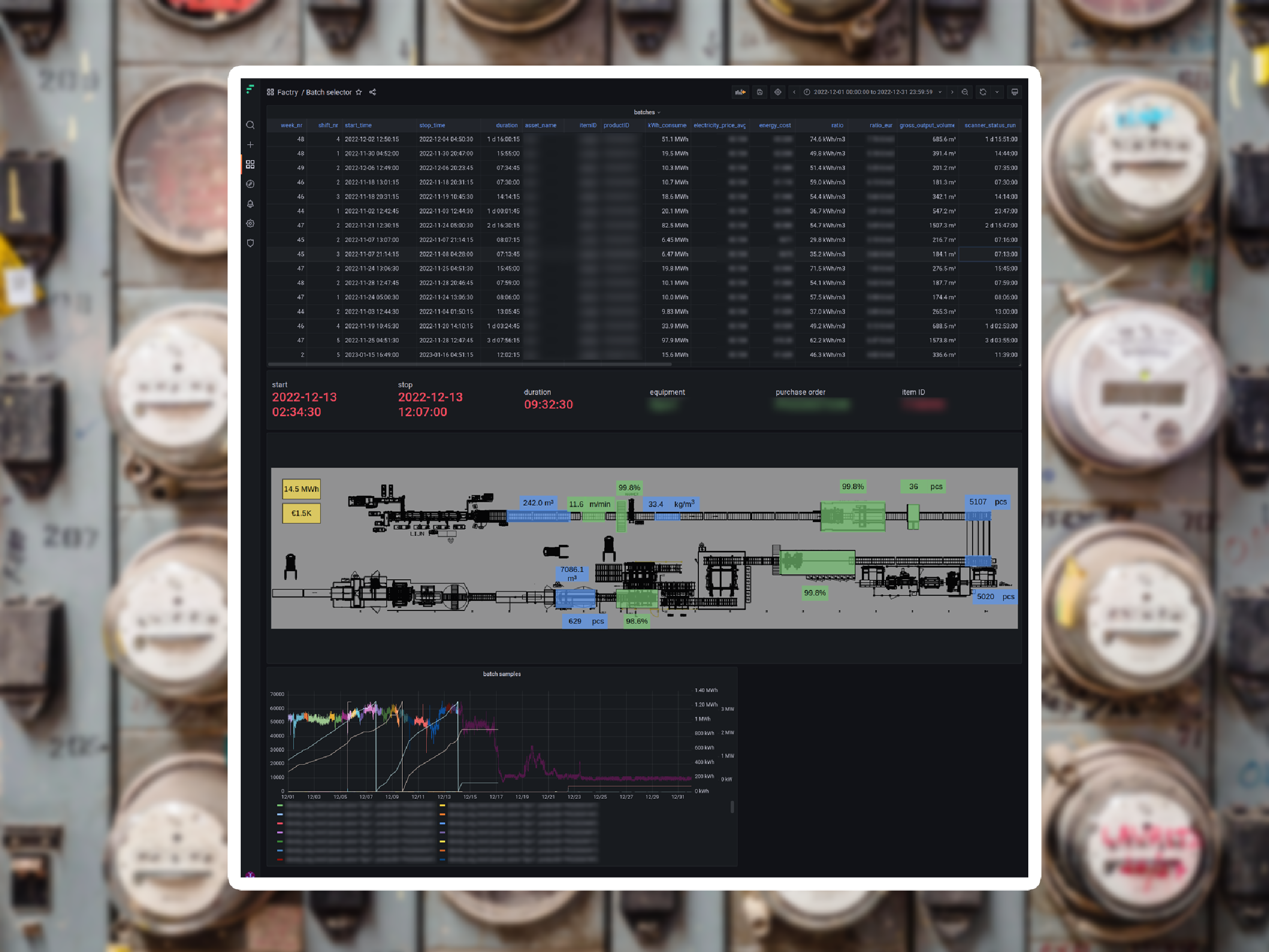
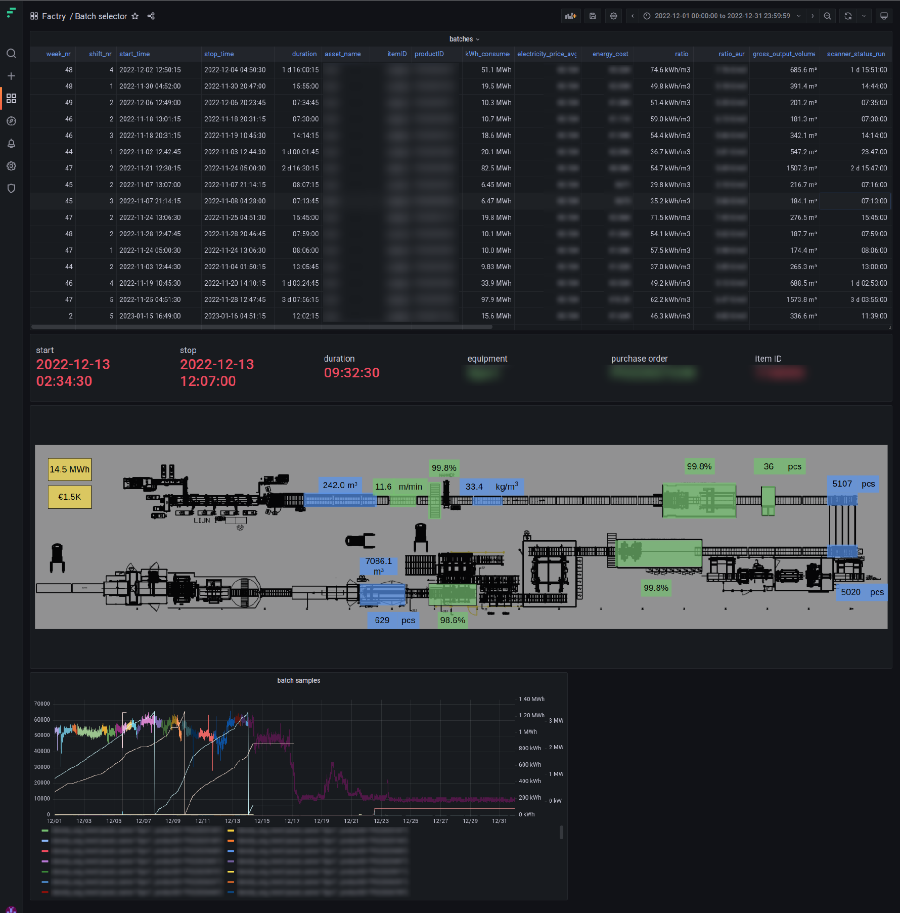
Example of a real-time production monitoring dashboard
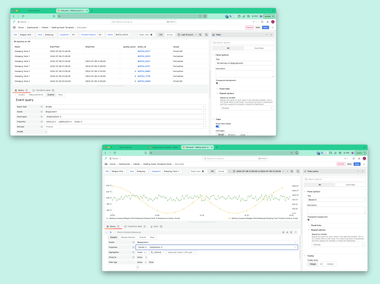
This real-life line monitoring dashboard includes an overview table displaying the batches produced on a certain production line (in this case the extruded polystyrene line: Xps1).
✔ In addition to the essential parameters such as start time, stop time, duration, and itemID, the table also shows the week number and shift number in which each batch was executed.
This additional data is provided by the Event Module in Factry Historian and is stored in the SQL database, enabling easy retrieval of the dataset for specific timeframes, e.g. weeks or shifts. By querying the database, the dataset can be obtained and used to generate a report, which in this case is modestly represented by the table.
✔ The table also presents the energy consumption allocated to each batch on this production line. If the output or performance of the line is trackable, a valuable KPI can be calculated to indicate the energy consumption relative to the produced output. In this case, the KPI is expressed in kilowatt-hours per cubic metre (kWh/m3) of extruded polystyrene (XPS) produced.
In addition, an estimate of the energy cost can be derived by means of multiplying the energy consumption for that particular batch on the production line with a monthly updated electricity price.
✔ Below the table, some key values are highlighted. These values are retrieved from the batch selected in the table by clicking on the itemID .
✔ Furthermore, a flowchart is displayed, providing a top-down view of the production line. The flowchart incorporates the data from the table and visually connects it to the corresponding equipment that measured the sensor data. When a different batch is selected in the table, the data in the flowchart automatically updates to reflect the selected batch.
In the flowchart, colours are used to represent good or bad values. For each equipment in the production line, the percentage of downtime compared to the batch duration is calculated. If this percentage exceeds a predefined threshold (can be set on equipment level), the equipment is shown in green. Otherwise, it is shown in red.
Additionally, blinking behaviour can be applied to certain elements in the flowchart to attract the attention of the operator, which cannot be conveyed through a static screenshot.
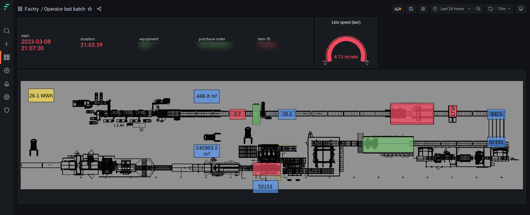
Simplified dashboard for better operator experience
This additional dashboard is quite similar to the previous one, with the key difference being that it automatically extracts data for the last batch in production and displays information specifically related to that batch.
This feature aims to improve the user experience for operators, by ensuring that the dashboard always presents the most up-to-date information.
In order to make the dashboard more manageable, it includes a simplified layout with fewer details.
As a result…
By collecting, monitoring and analysing real-time manufacturing data from their production lines, the company is now able to:
Identify bottlenecks, optimise workflows, and make data-driven decisions
Intervene faster in case of production issues, and schedule preventive maintenance
Achieve cost savings by optimising production line performance and minimising downtime
Reduce energy consumption, and set up an improvement programme
Scale and adapt its operations seamlessly through a flexible infrastructure
Ensure regulatory compliance by generating detailed reports, dashboards, and documentation
Read more about Factry Historian: the flexible data collection solution for Industry 4.0, used by companies in nearly 30 countries and 5 continents.
All about Factry Historian
Learn how Factry Historian can help you collect, store, and analyse industrial data